Rise Legal are a forward-thinking new solicitors based in St Albans.

Rise Legal are a forward-thinking new solicitors based in St Albans.
They were keen for a visual identity and design themes that would better represent their fresh outlook on law and allow them to break out of the traditional ‘stuffy’ mould. It’s a highly competitive, congested market so they wanted to differentiate themselves and stand out.
Visualise partnered with marketing agency TepFu to develop the name, strapline and positioning statements, which then guided the creative. The chosen concept is all about challenging convention, and this is demonstrated via the disrupted typing of the company name.


A portion of the ‘e’ has risen up, emphasising the name, while also allowing space for the word ‘legal’. The typeface Avenir was chosen for its open, rounded and friendly appearance, and the colour palette of navy and pink complements the brand imagery of starling murmuration in evening skies. This photographic approach is natural and abstract, but also represents ‘rising’ beautifully and reinforces the relationship between Rise Legal and their clients; protection, safety in numbers, working together.
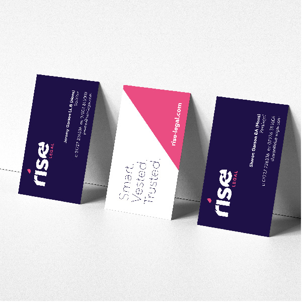
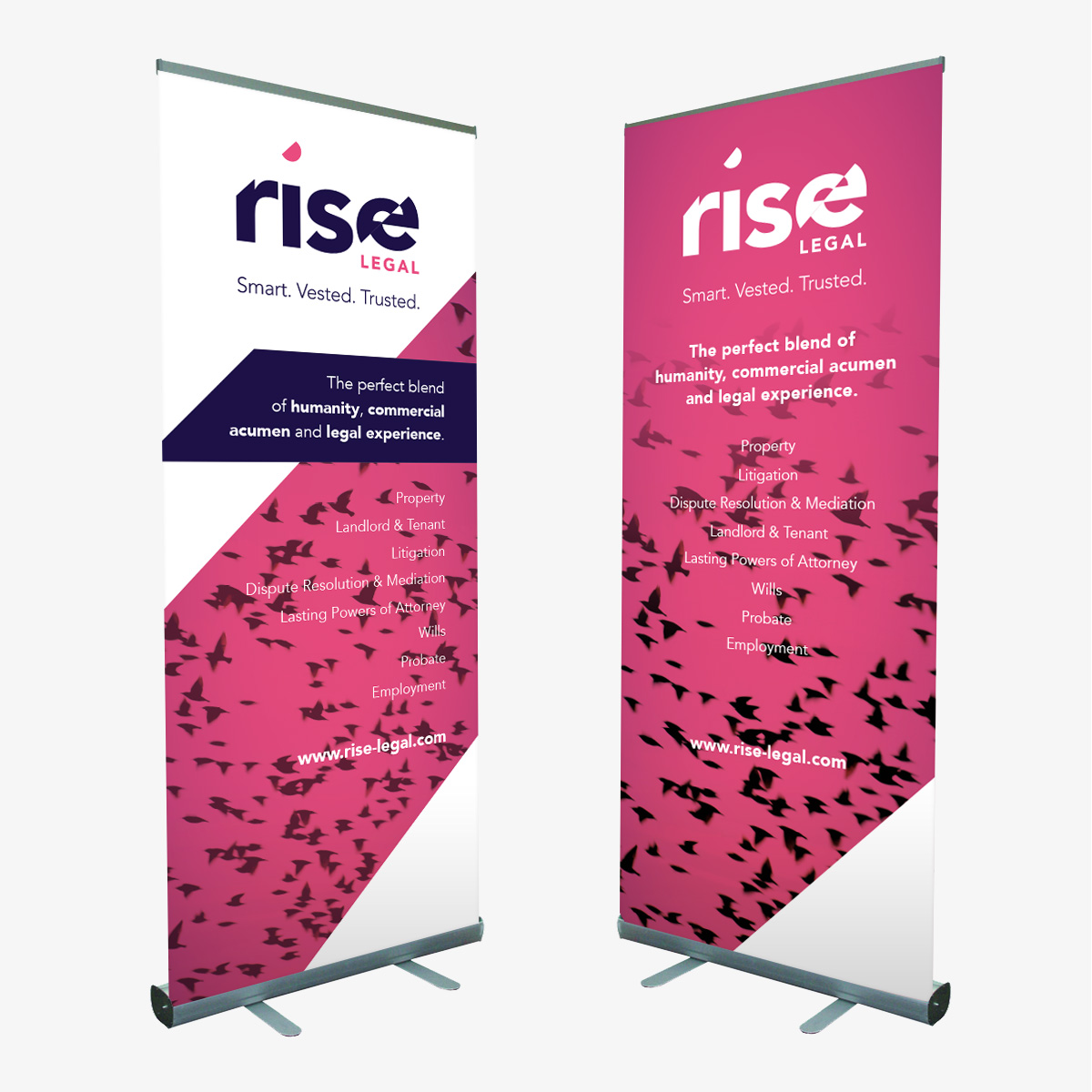
The Rise Legal team are delighted with their new brand and how it embodies the contemporary attitude of the organisation, together with their strapline ‘Smart. Vested. Trusted.’ And everything has been brought together, across their business stationery, social media templates and website, thanks to comprehensive brand guidelines.
Great service – helpful, personable and patient. And fantastic design, much positive feedback received from others, thank you!
Get in touch to understand how Visualise can help make your brand more memorable.